Accessibility Statement
My personal philosophy of Kirigoe (霧越) is about "crossing over the fog." It's a commitment to transforming the complex into the simple and finding clarity in a world of noise.
This belief is most critical to how I build and share my work, as well as from my experiences as a neurodiverse person. For many people, the "fog" isn't just a metaphor; it's a very real set of barriers. A digital world filled with low-contrast text, confusing navigation, or content that a screen reader can't understand is a world of obscurity.
Inaccessibility is the fog.
Therefore, my commitment to Kirigoe is a direct commitment to accessibility. It means I strive to build a space that is clear, understandable, and usable for everyone, regardless of their ability or the technology they use.
This site is built in accordance with the WCAG 2.2 Level AAA standards. This isn't just a technical checklist; it's the map I use to ensure the path is clear for all visitors. It's my way of making sure this space is open and welcoming, with no fog to cross.
The following accessibility checkers and tools will be used to bring this website into compliance:
- axe DevTools.
- Thorough accessibility check via DevTools. axe DevTools tests to WCAG 2.2 Level AAA.
- WebAim WAVE.
- The Web Accessibility Evaluation Tool checks compliance with WCAG 2.2 Level AAA. WAVE has strict color contrast testing requirements.
- Siteimprove.
- Another thorough accessibility checker via browser extension. Siteimprove checks up to WCAG 2.2 Level AAA. Currently the Siteimprove browser extension is reading Tailwind line-height classes incorrectly.
- SvelteKit built-in accessibility features.
- The SvelteKit platform provides notifications for any accessibility issues that may arise.
- Playwright + Guidepup.
- Playwright tests are used during deployment to check browser compatibility and run accessibility checks as well. Guidepup will be integrated for screenreading testing. All checks are run prior to pushing the source code to Github. The results are available in Github.
- Pa11y.
- Pa11y is utilized during the active development phase as an automated command-line tool. It runs rigorous accessibility scans against the local build environment, specifically testing for adherence to WCAG 2.2 Level AAA standards to catch and resolve issues immediately before code is committed. In the future, the results will be availabe within this website for full transparency.

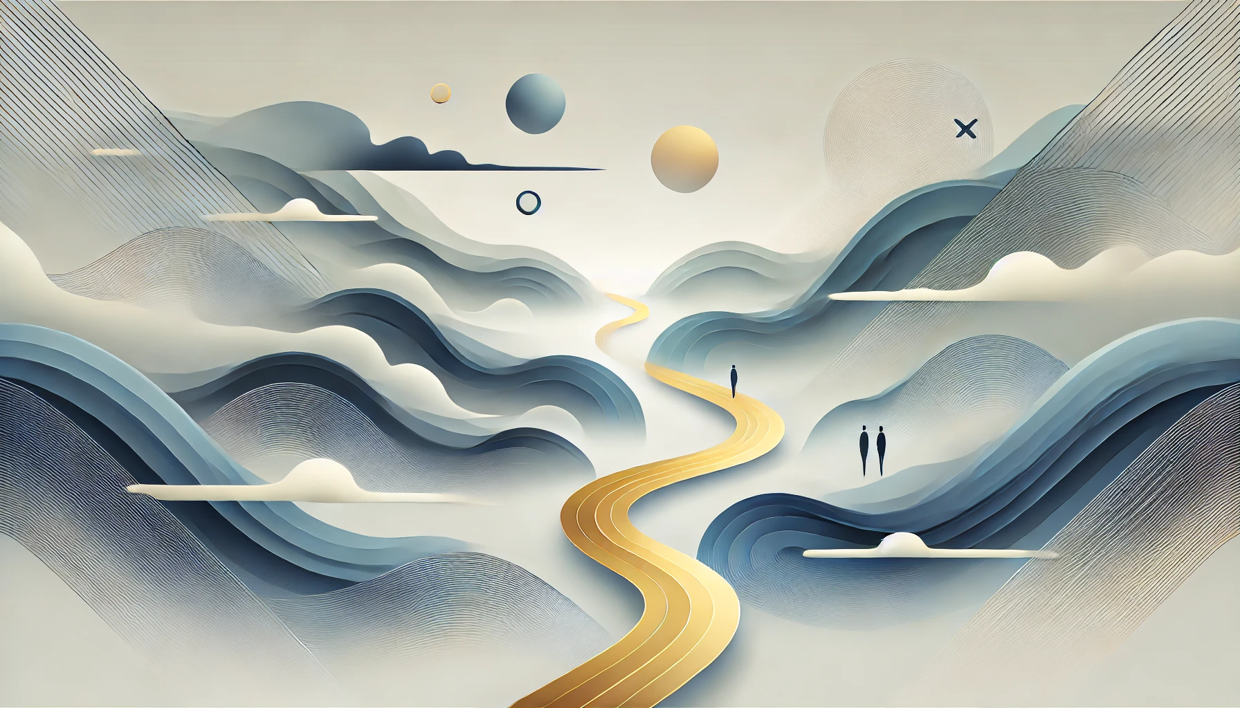
This is the second image was generated by DALL-E 5 with the following prompts; Create an abstract landscape design will keep it clean, modern, and symbolic, which is ideal for a startup website and base it on:
- A foggy valley represented with flowing gradient shapes in blue-gray.
- A winding golden path cutting through the mist, symbolizing clarity and transformation.
- Minimal, abstract human silhouettes fading into the fog to hint at identity and change.
- Flat, modern gradients and geometric abstraction, making it feel professional and web-ready.
The original image generated contained the kanji 霧越 subtly integrated into the mist as a textured detail, almost hidden. The kanji was removed for the website.